Are you ready to give your living room a fun new look? The year 2026 is bringing big changes in how we use color in our homes. Designers are moving away from cool, plain styles and are instead choosing colors that feel warm, cozy, rich, and welcoming. Your living room is the heart of your home, where you relax, gather, and socialize, so it is important that the design works well for real life. The biggest idea for the new trends is that rooms should feel personal and full of character. Let's explore the exciting 2026 Living Room Color Trends that will help you create a space you truly love.
Discover the Top 2026 Living Room Color Trends for a Cozy Home
Atunus Home Furniture
2025-12-15

Table of Contents
Embrace Warmth with Earthy 2026 Living Room Color Trends
In 2026, many of the most popular colors come straight from nature, giving your home a grounded and natural feel. This shift toward warmer colors means that the cool, icy blue and green tones of the past are melting away. Instead, we are looking for hues that have honesty and weight.
Chocolate Brown and Espresso Shades
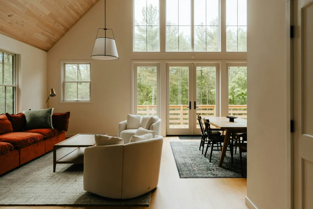
Dark browns are becoming very popular and are seen as a great replacement for black or charcoal because they offer a softer warmth. Chocolate brown is a trendy color that is quickly becoming a new classic neutral. In fact, chocolate brown is the top color many designers plan to use in 2026. This decadent color works well with both rustic and modern styles.
Benjamin Moore’s new key shade, "Silhouette," is a deep, smoky espresso brown with a hint of gray. This sophisticated color adds depth and elegant calm to a space. Another warm brown is "Saddle," which sits between rust and chocolate. This medium-toned brown has a mellow warmth that is perfect for a caramel twist on the brown trend. These deep browns give rooms a sense of richness and depth.
Khaki and Tan Neutrals
If you like neutrals, you are in luck, but the popular neutrals are changing. Grays are stepping aside for colors like taupes, khakis, and even beiges that have a warm feel. Sherwin-Williams named "Universal Khaki" as its Color of the Year for 2026 because it is a versatile and timeless tan. This soft tan has gentle yellow and brown undertones that make a space feel casually warm. It works well as a neutral background for bolder shades like deep green or rust. Another shade, "Epernay," is a refined, earthy soft ochre with hushed, beige undertones that channels the warmth of sunlit stone. These khaki shades stand as an elevated essential for 2026.
Deep and Cozy Jewel Tones: Key 2026 Living Room Color Trends
In 2026, people are feeling more confident about using bold, saturated colors. The new trend is all about colors that are expressive but still comforting, adding atmosphere instead of noise.
The Rise of Rich Burgundy and Plum
The darker end of the red spectrum, like burgundy (also called oxblood or black cherry), is having a major moment. This color is moody and aged, as if it has developed a patina, and it pairs well with the chocolate brown trend. Little Greene's Color of the Year, "Adventurer," is a regal plum aubergine hue. This shade is often linked to luxury and can bring tranquility and intimacy to rooms.
Graham & Brown's "Divine Damson" is a rich, dark red that adds drama to any space. It has a violet undertone that brings an elegant touch. Glidden's "Warm Mahogany" is a cozy, timeless red-orange that is softened by earthy brown undertones, making it great for intimate areas. When decorating with these rich colors, try pairing them with natural materials like velvet and linen to make them feel even richer.
Moody Teals and Dark Blues
Teal is another important color making a comeback. Mylands chose "Burlington Arcade," a dark teal that sits between green and blue, as its Color of the Year. This color is great for living rooms because it has a cocooning nature and brings a sense of balance and calm. Even though teal is often seen as a cool color, its complex undertones make it feel warm and inviting.
The Dulux 2026 color family is the "Rhythm of Blues," which includes a trio of indigo shades: "Mellow Flow™," "Slow Swing™," and "Free Groove™". These blues are fluid and flexible, letting you change the mood of your living space. Dark blues will be rich and enveloping, making rooms feel cocooning rather than cold.
Nature’s Palette: The Green 2026 Living Room Color Trends
Greens continue to be popular, but the cool, icy tones are being replaced by warmer, earthier shades touched with yellow or brown. These new greens feel restful and natural.
Soft Gray-Greens (Warm Eucalyptus)
Major paint brands are leaning toward warm colors, and cozy greens are definitely included. Valspar’s Color of the Year, "Warm Eucalyptus," is a soft gray-green, like sun-dried leaves with a comforting earthy undertone. This color is soothing and grounding, acting like a modern neutral. It’s a great choice for mindful living and slowing down. Another similar restorative color is "Sage Slate," which is also designed to create a peaceful place.
Earthy Olive and Botanical Hues
Earthy greens are becoming the new neutrals, reminding us of nature. These greens feel reassuringly timeless. Lick’s collection includes "Green 05," a deep olive richness that helps a room feel intimate and like a nurturing retreat.
"Midnight Garden" is a botanical green that feels fresh and welcoming, giving an outdoorsy, organic vibe inside. This color works well in living rooms, creating a softly energizing mood. Another shade, "Hidden Gem," is a rich blue-green with smoky, warm undertones that keeps it grounded and livable, creating an elegant, slightly moody feeling.
How to Use the New Neutral 2026 Living Room Color Trends
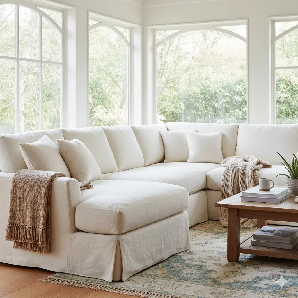
Although white and beige are timeless, designers are tired of seeing them used completely on their own, finding they can look flat and lifeless. The new neutrals are expressive and sophisticated, making them feel lived-in and human.
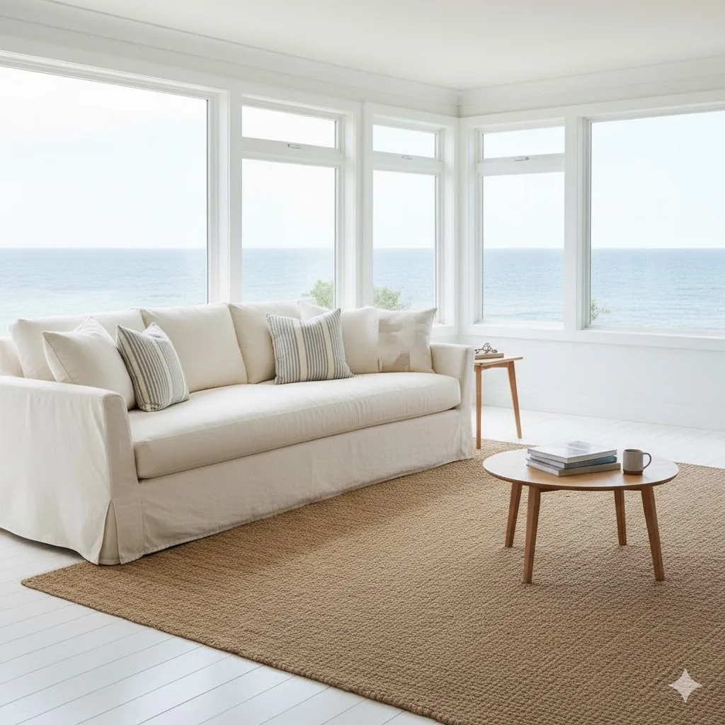
Creamy Whites and Ivories (Cloud Dancer and Epernay)
If you still love neutrals, designers suggest pairing softer shades of white and beige with rich, earthy tones like rust, chocolate brown, and olive green. Pantone chose "Cloud Dancer" as its Color of the Year for 2026. This warm, creamy white acts as a dependable base color. It is described as an ethereal hue that brings a calming influence. It helps quiet the mind, which is great for relaxation and focus.
"Melodious Ivory" is another pale, creamy neutral that is lighter and brighter, offering a timeless and easygoing appeal. It works well as a calm background for brighter colors like burgundy or watery blue. "Epernay" is a luminous warm white, serving as a refined choice that beautifully highlights art and rich wood tones.
Pairing Neutrals with Rich Tones
The concept of "earthy vibrancy" is key here. This is a saturated version of a colorful neutral that includes rich tones found in nature like muddy blues, moss and gray greens, pinks, rusts, and ochres. The goal is to use these colors in combinations you might not usually think of, because mother nature puts them together best. For instance, using blues and greens in the living room and balancing them with light to medium gray or white fabrics is a great approach. You can also use colors like eggplant as an exciting alternative to standard grays and blacks.
Creating Moods with 2026 Living Room Color Trends
Color is a game-changer in making living spaces flexible and versatile, especially since the living room needs to work for many activities throughout the day. By using color stories, you can easily change the feeling or "energy" of your room.
Bold Color Blocking (The Free Story)
If you want a look that is joyful and unexpected, you can use the "Free color story". This look uses bright colors, like yellow and green, with techniques like color blocking on walls and ceilings. You can use a vibrant blue like "Free Groove™" as a hero color for clever contrast. This color story brings emotional benefits like energy and creativity, and practically, it can lead to increased productivity.
Calming Shades for Relaxation (The Slow Story)
For a space where you can truly relax and recharge, the "Slow color story" is perfect. This story uses misty blue paint to give a peaceful, cocooning feel. The hero blue in this palette, "Slow Swing™," is a dark blue that is grounding and brings a sense of stability when used with a neutral scheme. This palette promotes calm and relaxation, which can help with improved focus and sleep.
Another choice for a cozy atmosphere is the "Flow colour story," which uses warm neutrals and terracottas balanced with a soft sky blue like "Mellow Flow™". This combination brings warmth and comfort and is great for enhanced social interactions.
Saying Goodbye to Old 2026 Living Room Color Trends
Knowing what is going out of style is just as important as knowing what is coming in when you plan a refresh. Designers are looking to leave behind trends that take the personality and coziness out of the living room.
Moving Past Ultra-Minimalist Beige and White
The ultra-minimalist look, especially when it relies solely on beige and white, is losing popularity. Designers feel that the overly beige, quiet luxury look is losing steam because it can appear flat and lifeless, lacking contrast. People are seeking more expressive palettes. While modern, streamlined furniture is still liked, designers prefer to see it mixed with traditional details and curved shapes, rather than used exclusively.
Ditching Cool Grays and Lifeless Palettes
Gray, which was once the most popular neutral, is giving way to warmer tones. Also, designers are tired of matching furniture sets, which can make a space feel overly staged and take away its individuality. They recommend instead trying eclectic layering, which means mixing contemporary and vintage pieces, and combining materials like metal and wood. The trends going out are often those that fail to prioritize enjoyment and functionality in the living room.
Summary of Key 2026 Living Room Color Trends
Here is a quick look at the popular colors defining 2026, many of which focus on warmth, depth, and connecting to nature:
Color Family | Trend Name / Example Shade | Feeling and Use |
Warm Browns | Chocolate Brown, Silhouette (Espresso), Saddle | Rich, sophisticated, and elegant; acts as a sophisticated neutral with depth. |
Earthy Neutrals | Khaki, Universal Khaki, Cloud Dancer (Creamy White) | Versatile, timeless, and softly warm; great base color or backdrop for bold accents. |
Deep Reds/Plums | Burgundy, Divine Damson, Warm Mahogany, Adventurer | Moody, dramatic, and luxurious; perfect for creating a cozy, intimate atmosphere. |
Restorative Greens | Warm Eucalyptus, Green 05 (Olive), Midnight Garden | Calming, grounded, and organic; brings a natural, soothing vibe indoors. |
Deep Blues/Teals | Burlington Arcade, Rhythm of Blues (Indigo Shades) | Enveloping, serene, and deep; creates a cocooning sense of balance and calm. |
Conclusion
The 2026 Living Room Color Trends are telling us that our homes should be filled with personality, warmth, and comfort. We are saying goodbye to cold, super-minimalist spaces and welcoming in deep, rich colors and creamy, earthy neutrals. Whether you choose a moody blue or a cozy chocolate brown, the goal is to create a layered and lived-in look. To bring these exciting new palettes into your space, Atunus Home offers a range of furnishings and decor that perfectly match these earthy, sophisticated color stories. You can find pieces at Atunus Home that help you mix textures and embrace the layered, personal style that defines 2026 interior design.
FAQ (Frequently Asked Questions)
Q: What is the main idea behind the 2026 Living Room Color Trends?
A: The main idea is a shift toward warm, rich, welcoming, and cozy living room designs. Instead of plain beige and white, people want expressive palettes that feel sophisticated and lived-in.
Q: Which color palettes are going out of style in 2026?
A: Designers suggest moving away from ultra-minimalist beige and white themes because they can look flat and lifeless. Also, cool, icy blue and green tones are stepping aside for warmer, earthier versions.
Q: What is "Earthy Vibrancy"?
A: "Earthy vibrancy" is a phrase used by designers to describe rich tones found in nature. These are colors that are deep in saturation, like moss and gray greens, ochres, muddy blues, rusts, and pinks. It is about using these natural color combinations to create an energizing yet soothing effect.
Q: How can I use bold colors if I am nervous about change?
A: If you are afraid of too much color, you can start small. Try introducing the new colors through art or pillows first, as this is a good way to get your creative ideas flowing. You can also try painting just one accent wall or bringing in the colors through smaller accessories like curtains or cushions.
Q: Are neutrals still popular for living rooms?
A: Yes, neutrals are still popular, but they are changing. The new favorite neutrals are warm, creamy shades like "Cloud Dancer" and earthy tones like khaki and taupe, which help set a grounding and inviting mood. These work well when paired with rich, deep colors for contrast.